


Abstract
Designing effective packaging for food products is a multifaceted discipline that extends beyond mere aesthetics, functioning as a critical interface between the producer, the product, and the consumer. This process involves a synthesis of market analysis, regulatory compliance, material science, and brand communication. An examination of the process reveals that successful packaging must protect the integrity and safety of its contents while adhering to the stringent legal frameworks of target markets, such as those governed by the FDA in the United States and the EFSA in the European Union. Furthermore, the selection of materials, particularly the growing preference for sustainable options like eco-friendly paper bags, reflects a brand’s ethical stance and resonates with consumer values. The visual and structural design elements work in concert to create a compelling brand narrative, facilitate a positive user experience, and ultimately drive purchasing decisions on a competitive shelf. The entire endeavor, from initial concept to final production, demands a holistic approach that balances functionality, compliance, and marketing appeal.
Key Takeaways
- Begin with deep analysis of your target US or EU audience and competitors.
- Strictly adhere to FDA and EU food safety and labeling regulations.
- Choose materials that ensure product safety and align with brand values.
- The process of how to design packaging for food products must balance aesthetics with structural integrity.
- Develop a clear visual hierarchy to communicate your brand story instantly.
- Collaborate with an experienced packaging manufacturer for quality and compliance.
- Test your packaging design for durability, user experience, and market reception.
Table of Contents
- Step 1: Foundational Market & Product Analysis
- Step 2: Navigating the Regulatory Labyrinth (US & EU)
- Step 3: Material Selection – The Physical Embodiment of Your Brand
- Step 4: Structural Design – Functionality Meets Form
- Step 5: Visual Design & Branding – The Silent Salesperson
- Step 6: Information Hierarchy & Communication
- Step 7: Sourcing, Production, and Launch
- Frequently Asked Questions (FAQ)
- Conclusion
- References
Step 1: Foundational Market & Product Analysis
Before a single line is drawn or a color is chosen, the intellectual groundwork must be laid. The endeavor of designing packaging for a food product is not an exercise in pure creativity; it is a strategic response to a complex web of human desires, market forces, and product realities. To begin this journey without a thorough analysis is akin to setting sail without a map or a compass. The destination is unknown, and the risks of failure are immense. Therefore, the first and most fundamental step is to understand the world your product is about to enter. This involves a tripartite investigation: a deep dive into the psyche of your target consumer, a clear-eyed definition of your product’s intrinsic value, and a meticulous survey of the competitive terrain. Each of these components informs the others, creating a rich tapestry of insights that will guide every subsequent design decision.
Understanding Your Target Audience (US vs. EU)
The consumer is not a monolithic entity. A shopper in Des Moines, Iowa, approaches the grocery aisle with a different set of cultural assumptions, aesthetic preferences, and purchasing habits than a shopper in Lyon, France. Recognizing these distinctions is paramount.
In the United States, the consumer landscape is often characterized by a demand for convenience, value, and bold, clear messaging. The pace of life can be rapid, and packaging must often compete for attention in large, visually saturated retail environments. A design that is immediately recognizable from a distance, that clearly communicates its primary benefit (e.g., “High Protein,” “Keto-Friendly,” “Family Size”), and that is easy to handle, open, and store often holds an advantage. American consumers are also highly responsive to branding that evokes a sense of trust, tradition, or, conversely, cutting-edge innovation.
In contrast, the European consumer, while also valuing convenience, often places a greater emphasis on product provenance, ingredient quality, and sustainability. There is frequently a deeper cultural connection to food, and packaging that reflects this sensibility through more subtle, minimalist, or artisanal design cues can be highly effective. The EU’s robust regulatory environment has also fostered a more informed consumer base, one that is accustomed to looking for specific certifications (like organic logos) and nutritional information systems such as the Nutri-Score. A design that feels overly commercial or that lacks transparency about its environmental impact may be met with skepticism. Your approach to learning how to design packaging for food products must account for these deep-seated cultural currents.
Defining Your Product’s Unique Selling Proposition (USP)
With a picture of your target consumer in mind, you must turn your gaze inward to your product itself. What is its essence? What singular promise does it make to the consumer that no other product on the shelf can? This is its Unique Selling Proposition (USP). The packaging is the primary vehicle for delivering this message.
Is your product a small-batch, artisanal jam made from a family recipe? The packaging should communicate this through materials, typography, and imagery that evoke heritage, craftsmanship, and authenticity. Perhaps it’s a technologically advanced plant-based protein powder. In this case, the design should feel clean, scientific, and modern, inspiring confidence in its efficacy.
Consider the following questions to distill your USP:
- Origin: Where do the ingredients come from? Is it locally sourced? Does it hail from a region famous for that particular food?
- Process: How is it made? Is it handcrafted, slow-cooked, cold-pressed, or fermented?
- Ingredients: Is it organic, non-GMO, gluten-free, sugar-free, or made with a rare or exotic ingredient?
- Benefit: What problem does it solve for the consumer? Does it provide energy, aid digestion, offer a healthy indulgence, or save time?
The answer to these questions forms the core narrative of your product. The packaging’s job is to tell this story in a single, compelling glance.
Competitive Landscape Analysis
Your product will not exist in a vacuum. It will sit on a shelf—physical or digital—surrounded by competitors all vying for the same consumer’s attention. To ignore them is to enter the conversation blindfolded. A thorough competitive analysis allows you to understand the established visual language of your category and, crucially, to find opportunities to differentiate your product.
Begin by gathering samples of your top competitors’ packaging. Analyze them systematically:
- Visuals: What colors, fonts, and images are they using? Is there a dominant trend? For example, in the health food aisle, you might see a sea of green, white, and earthy tones.
- Structure: What shapes and materials are common? Are they using boxes, pouches, or jars? Are there features like resealable zippers or easy-pour spouts?
- Messaging: What are their key claims? Are they focused on taste, health benefits, price, or origin?
This analysis will reveal the “rules” of your category. You can then make a strategic choice: do you follow these rules to meet consumer expectations, or do you break them to create something disruptive and novel? If every competitor uses photographic imagery, perhaps a bold, illustrative approach will stand out. If all other packages are brightly colored, a minimalist black-and-white design could capture attention through its quiet confidence. This is where your understanding of the target audience and your USP becomes critical. A disruptive design must still resonate with the consumer and feel appropriate for the product inside. This strategic positioning is a cornerstone of mastering how to design packaging for food products.
Step 2: Navigating the Regulatory Labyrinth (US & EU)
The design of food packaging is a creative endeavor bounded by unyielding scientific and legal constraints. The package is not merely a container; it is a guardian, tasked with protecting its contents from contamination and degradation. It is also a legal document, obligated to present specific information to the consumer in a clear and truthful manner. The regulatory landscapes of the United States and the European Union, while sharing the common goal of consumer safety, have distinct topographies. Navigating them requires diligence, precision, and an unwavering commitment to compliance. Failure to do so can result in costly recalls, legal penalties, and irreparable damage to a brand’s reputation.
Core US Food Packaging Regulations (FDA)
In the United States, the primary regulatory body overseeing food and its packaging is the Food and Drug Administration (FDA). Its authority stems from the Federal Food, Drug, and Cosmetic Act (FD&C Act).
A central concept is that of “food-contact substances” (FCS). Any material used in packaging that may come into contact with food is considered an indirect food additive. As such, it must be deemed safe for its intended use. This means the materials themselves—the papers, plastics, inks, and adhesives—must either be Generally Recognized as Safe (GRAS), have a prior sanction, or be approved through a Food Contact Notification (FCN) submission. Manufacturers of materials, including those for paper food packaging, must be able to provide documentation demonstrating the safety of their products for the intended food type and conditions of use (e.g., high temperature, high fat).
Beyond the material’s safety, the FDA mandates specific labeling requirements, largely governed by the Nutrition Labeling and Education Act (NLEA) and the Food Allergen Labeling and Consumer Protection Act (FALCPA). Key elements include:
- Statement of Identity: The common name of the food.
- Net Quantity of Contents: The amount of product, displayed on the bottom 30% of the principal display panel.
- Nutrition Facts Panel: A standardized panel detailing serving size, calories, and key nutrients. The format was updated in recent years to include “added sugars” and more realistic serving sizes.
- Ingredient List: All ingredients listed in descending order by weight.
- Allergen Declaration: The presence of any of the major nine allergens (milk, eggs, fish, crustacean shellfish, tree nuts, peanuts, wheat, soybeans, and sesame) must be clearly stated.
- Name and Address: The name and place of business of the manufacturer, packer, or distributor.
Key EU Food Packaging Regulations (EFSA)
The European Union’s approach is coordinated by the European Food Safety Authority (EFSA), which provides scientific advice to inform the laws enacted by the European Commission. The foundational legal text is the Framework Regulation (EC) No 1935/2004. It sets the general principles of safety for all food contact materials (FCMs). Its core tenet is that materials must not transfer their constituents to food in quantities that could endanger human health, bring about an unacceptable change in the composition of the food, or deteriorate its taste and smell.
For specific materials, the EU has more detailed measures. For example, the Plastics Regulation (EU) No 10/2011 establishes a “Union list” of authorized substances for use in plastic FCMs and sets specific migration limits (SMLs) for these substances. All plastic materials intended for food contact must be accompanied by a Declaration of Compliance (DoC) that confirms they meet these requirements.
Labeling is governed by the Food Information to Consumers (FIC) Regulation (EU) No 1169/2011. Its goal is to enable consumers to make informed choices. The requirements are extensive and include:
- Name of the Food: The legal name of the food.
- List of Ingredients: Presented in descending order of weight.
- Allergen Information: The 14 major EU allergens must be emphasized in the ingredient list (e.g., using bold or italic font).
- Net Quantity: The net weight or volume of the food.
- Date Marking: A “use by” date for perishable foods or a “best before” date for others.
- Country of Origin or Place of Provenance (COO): Mandatory for certain products like meat, and required if its absence could mislead the consumer.
- Nutrition Declaration: A mandatory panel that must include energy value and the amounts of fat, saturates, carbohydrate, sugars, protein, and salt.
A significant recent development is the European Green Deal and the proposed Packaging and Packaging Waste Regulation (PPWR), which aims to make all packaging reusable or recyclable in an economically viable way by 2030. This places immense pressure on designers and brands to prioritize sustainability in their packaging choices.
A Comparative Table of US vs. EU Labeling Requirements
To grasp the practical differences, a side-by-side comparison is illuminating. While many principles overlap, the details diverge in ways that necessitate distinct packaging designs or complex dual-labeling strategies.
| Fonctionnalité | United States (FDA) | European Union (EU) |
|---|---|---|
| Nutrition Panel | Nutrition Facts | Nutrition Declaration |
| Key Nutrients | Calories, Total Fat, Sat. Fat, Trans Fat, Cholesterol, Sodium, Total Carb., Fiber, Sugars, Added Sugars, Protein, Vit. D, Calcium, Iron, Potassium. | Energy (kJ/kcal), Fat, Saturates, Carbohydrate, Sugars, Protein, Salt. |
| Serving Size | Defined by FDA based on Reference Amounts Customarily Consumed (RACCs). | Typically per 100g/100ml, with optional per-portion information. |
| Allergen Listing | 9 major allergens. Can be listed in a “Contains” statement or within the ingredient list. | 14 major allergens. Must be emphasized (e.g., bold, italics, underline) within the ingredient list. |
| Date Marking | Not federally mandated for most foods, except infant formula. “Best by,” “use by” are voluntary quality indicators. | Mandatory. “Use by” for safety-perishable foods; “Best before” for quality. |
| Origin Labeling | Mandatory for certain commodities under COOL (e.g., meat, fish, produce). | Mandatory for specific foods (e.g., meat, honey, olive oil) and when its omission could be misleading. |
| Units of Measure | Must use both US Customary (e.g., oz, fl oz) and metric (g, ml). | Metric system only (g, kg, ml, l). |
This table underscores a crucial point in the process of how to design packaging for food products for international markets: a one-size-fits-all approach is rarely feasible. A package destined for both New York and Berlin must be meticulously designed to accommodate two different sets of rules, a challenge that requires expertise and careful planning.
Step 3: Material Selection – The Physical Embodiment of Your Brand
The choice of material for food packaging is a decision of profound consequence. It is a technical choice, dictated by the physical and chemical properties of the food it must protect. It is an economic choice, influencing production costs and shipping weights. And, increasingly, it is an ethical choice, a tangible statement of a brand’s values and its commitment to environmental stewardship. The material is the first thing a consumer touches; its weight, texture, and temperature convey a message long before any words are read. It is the silent, tactile ambassador of your product.
The Spectrum of Food Packaging Materials
The palette of available materials is broad, each with its own unique set of strengths and weaknesses. Understanding this spectrum is the first step toward making an informed choice.
- Glass: Glass is perceived as a premium material, suggesting quality and purity. It is chemically inert, meaning it won’t react with the food, and it provides an excellent barrier against moisture and gases, preserving flavor and freshness. It is also infinitely recyclable. However, its drawbacks are significant: it is heavy, which increases transportation costs and carbon footprint, and it is fragile, requiring additional protective packaging during shipping.
- Metal: Typically aluminum or steel, metal is used for cans and foils. It offers an unparalleled barrier to light, water, and oxygen, providing the longest shelf life for many products. It is durable and highly recyclable. The primary limitations are its opacity—the consumer cannot see the product—and the potential for a metallic taste to transfer to certain acidic foods if not properly coated.
- Plastics: This is the most diverse category, encompassing a wide range of polymers from rigid PET (for bottles) to flexible LDPE (for films). Plastics are lightweight, durable, and can be molded into virtually any shape. They offer a wide range of barrier properties that can be tailored to specific products. The major challenge facing plastics is their environmental impact. While many are recyclable, recycling rates are low, and public concern over plastic pollution is at an all-time high. This has led to a push for plastics made from recycled content (rPET) or bio-based sources.
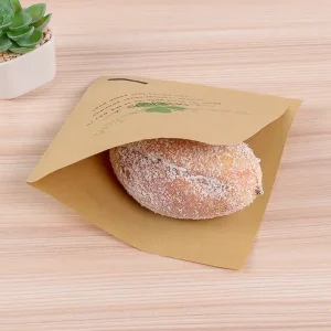
- Paper and Paperboard: Derived from a renewable resource, paper and paperboard are widely used for cartons, boxes, labels, and bags. They are lightweight, relatively inexpensive, and easily printed upon. They are also highly recyclable and biodegradable, giving them a strong environmental profile. Standard paper, however, offers little protection against moisture or oxygen. To be used for many food products, it must be coated, laminated, or combined with other materials like plastic or aluminum foil, which can sometimes complicate its recyclability. The versatility of options, from simple kraft paper to complex multi-layer cartons, makes this a dynamic category.
The Rise of Sustainable & Eco-Friendly Materials
The modern consumer, particularly in the EU and among younger demographics in the US, is increasingly making purchasing decisions based on a brand’s environmental credentials. This has propelled sustainability from a niche concern to a central pillar of packaging design. The question is no longer just “Does it work?” but “What is its impact?”.
This shift has fueled innovation in several key areas:
- Recycled Content: Using post-consumer recycled (PCR) materials, such as rPET for plastic bottles or recycled fibers for paperboard, reduces the need for virgin resources and diverts waste from landfills. Brands are now proudly displaying their percentage of PCR content on their labels.
- Plant-Based Materials: Polylactic acid (PLA), a plastic derived from corn starch or sugarcane, is a prominent example. It looks and feels like traditional plastic but is commercially compostable. Other innovations include packaging made from mushrooms, seaweed, or agricultural waste.
- Improved Recyclability: Design for recycling is a growing discipline. This involves moving away from multi-material laminates that are difficult to separate and toward mono-material solutions. It also means avoiding problematic additives, colors, and labels that can contaminate the recycling stream.
- Paper-Based Solutions: There is a significant movement toward replacing plastics with paper where feasible. The development of new coatings and barrier technologies is making it possible to use sacs en papier écologiques and other paper food packaging for products that previously required plastic. Sourcing from responsibly managed forests, as certified by organizations like the Forest Stewardship Council (FSC), adds another layer of assurance (Unicopacking, 2025).
Matching Material to Product Needs
The theoretical appeal of a material must be tested against the practical demands of the product. An effective process for how to design packaging for food products involves a meticulous matching of the food’s properties to the material’s capabilities. A mismatch can lead to spoiled product, shortened shelf life, and a poor consumer experience.
Consider this a form of matchmaking, where the goal is a stable, long-lasting relationship between the product and its package.
| Food Category | Key Protection Needs | Suitable Material Examples |
|---|---|---|
| Dry Goods (Flour, Pasta, Cereal) | Moisture barrier, pest protection, structural strength for stacking. | Coated paperboard boxes, multi-wall paper sacks, flexible plastic films. |
| Fatty & Oily Foods (Chips, Nuts, Cookies) | Oxygen barrier to prevent rancidity, grease resistance. | Metallized plastic films (e.g., in chip bags), glassine paper liners, grease-resistant coated paper. |
| Acidic Foods (Tomato Sauce, Pickles) | Chemically non-reactive material to prevent corrosion and off-flavors. | Glass jars, cans with a protective polymer coating. |
| Moist Foods (Cheese, Baked Goods) | Controlled moisture barrier (to prevent drying out but avoid sogginess), breathability for some cheeses. | Waxed paper, perforated plastic films, stand-up pouches with resealable zippers. |
| Beverages (Juice, Milk, Soda) | Liquid containment, oxygen/light barrier (for nutrient preservation), pressure resistance (for carbonation). | Glass bottles, aluminum cans, aseptic cartons (e.g., Tetra Pak), PET plastic bottles. |
| Frozen Foods | Durability at low temperatures (to prevent cracking), moisture barrier to prevent freezer burn. | Coated paperboard, durable plastic bags (e.g., PE), vacuum-sealed pouches. |
This analysis is not merely academic; it is the scientific core of packaging design. Choosing a beautiful paper bag for oily potato chips without ensuring it has a proper grease-resistant lining will result in an unsightly, compromised product. Selecting a clear glass jar for a light-sensitive oil will lead to rapid degradation. The material choice must serve the product first and foremost. Only then can it effectively serve the brand.
Step 4: Structural Design – Functionality Meets Form
If the material is the flesh and bone of the package, its structure is the skeleton. Structural design is the discipline of shaping that material into a three-dimensional form that is not only visually appealing but also functional, protective, and intuitive to use. It dictates how the package is assembled, how it protects the product during its perilous journey from factory to pantry, and how the end consumer interacts with it. A brilliant graphic design on a poorly constructed package is like a beautiful painting on a crumbling wall—its appeal is fleeting and ultimately undermined by its foundational weakness. An effective strategy for how to design packaging for food products must therefore treat structural engineering with the same reverence as graphic artistry.
The Unboxing Experience as a Marketing Tool
In the age of social media, the act of opening a product is no longer a private, mundane event. It has become a public performance, a ritual known as “unboxing.” A thoughtfully designed structure can transform this ritual into a powerful marketing moment. The experience should feel satisfying, not frustrating. It should guide the user’s hands, revealing the product in a deliberate and often delightful way.
Consider the difference between a product sealed in a clamshell plastic package that requires scissors and significant force to open, and a box that opens with the pull of a simple tear-strip, revealing the product nestled perfectly inside. The former creates a moment of friction and annoyance; the latter creates a moment of satisfaction and reinforces a perception of quality.
Key elements of a positive user experience include:
- Ease of Opening: Can the consumer open it without tools or excessive force? Features like tear notches, perforated lines, and well-designed tabs are crucial.
- Re-sealability: For multi-serving products, can the package be easily and effectively re-closed to maintain freshness? Zippers, press-to-seal closures, and screw caps are common solutions.
- Dispensing: Does the structure facilitate easy and clean dispensing of the product? Think of the pour spout on a carton of milk, the shaker top on a spice jar, or the pump on a syrup bottle.
- Storage: Does the package’s shape allow for efficient storage in a pantry or refrigerator? Stackable, rectangular forms are often more practical than irregular shapes.
Types of Packaging Structures
The vocabulary of structural design is vast, with established forms that have been refined over decades and new innovations emerging constantly. Understanding the basic categories is essential.
- Bags and Pouches: This is one of the most versatile and rapidly growing categories.
- Pillow Pouches: Simple, economical bags used for products like chips and candy.
- Stand-Up Pouches (SUPs): These have a gusset at the bottom that allows them to stand upright on the shelf, creating a “billboard” effect. They often include zippers for re-sealability and are used for everything from granola to pet food.
- Gusseted Bags: These have folds on the sides or bottom that expand to hold more volume, common for coffee beans or flour. This includes formats like the pinch-bottom bag, which offers a clean, sealed finish ().
- Paper Bags: Ranging from simple SOS (Self-Opening Satchel) bags for bakery items to sturdy shopping bags with handles, paper offers a sustainable and tactile option.
- Boxes and Cartons: Made from paperboard, these structures offer excellent print surfaces and good structural protection.
- Folding Cartons: The standard box for cereal, crackers, and tea. They are shipped flat to the producer and then erected and filled.
- Aseptic Cartons: Multi-layer cartons (like those from Tetra Pak or SIG) that allow liquids to be stored without refrigeration. They are made of paper, plastic, and aluminum.
- Gable-Top Cartons: The familiar shape used for milk and juice, offering an integrated pour spout.
- Jars, Bottles, and Cans: These are rigid containers, typically made of glass, plastic, or metal. Their primary advantage is their strength and excellent barrier properties. The design considerations here involve the shape of the container, the type of closure (screw cap, cork, crown cap), and the ergonomics of holding and pouring from it.
- Trays and Clamshells: Often made of plastic or molded fiber, these are used to hold and protect delicate items like produce, eggs, or baked goods. A clamshell is a one-piece container with a hinged lid.
Prototyping and Testing for Durability
A structure that looks perfect on a computer screen may fail spectacularly in the real world. The journey of a food product is fraught with peril: it will be stacked in warehouses, vibrated on trucks, jostled on pallets, dropped by stockers, and handled by countless consumers. The structural design must anticipate and withstand these challenges.
This is where prototyping and physical testing become indispensable.
- Digital Prototyping: Software can simulate stresses and strains, but it cannot fully replicate real-world chaos.
- Physical Mockups: Creating unprinted, “white” mockups allows you to assess the ergonomics, assembly, and basic strength of the design. Does it feel good in the hand? Is it easy to assemble on a production line?
- Performance Testing: This is the crucial phase where the prototype, filled with a stand-in for the actual product, is subjected to a battery of standardized tests.
- Drop Tests: The package is dropped from various heights and angles to simulate being dropped during shipping or by a consumer.
- Vibration Tests: The package is placed on a vibration table that simulates the motion of a truck or train to see if it can withstand the constant shaking without seams splitting or the product being damaged.
- Compression Tests: The package is subjected to pressure from above to determine its stacking strength. This is critical for ensuring that pallets of product can be stacked in a warehouse without the bottom layer being crushed.
- Environmental Testing: The package is placed in chambers that simulate different temperatures and humidity levels to see how the materials and seals hold up over time.
Only through this rigorous process of testing and refinement can you have confidence that your structural design will fulfill its most fundamental duty: to deliver the product to the consumer in perfect condition. Mastering this aspect of how to design packaging for food products is non-negotiable.
Step 5: Visual Design & Branding – The Silent Salesperson
Once the foundational analysis is complete, the regulatory requirements are understood, and the material and structure have been chosen, the canvas is finally ready. Visual design is the process of applying color, typography, and imagery to that canvas to communicate the product’s story, create an emotional connection, and drive a purchase. On a crowded shelf, the package has only a few seconds to capture a shopper’s attention and convey its message. It is a silent salesperson, and its success depends on a sophisticated understanding of visual language and human psychology. This is where the brand’s soul is given visible form.
The Psychology of Color in Food Packaging
Color is the most immediate and powerful visual cue. It is processed by the brain faster than text or even complex shapes, and it triggers immediate emotional and associative responses. However, these responses are not always universal; they are shaped by culture, personal experience, and the context of the product category.
- Red: A highly energetic and attention-grabbing color. It can stimulate the appetite and is often associated with excitement, passion, and boldness. It’s frequently used for brands that want to convey speed (like fast food), intensity (like spicy sauces), or indulgence (like decadent chocolates).
- Green: The quintessential color of nature, health, and freshness. It is the go-to choice for organic, plant-based, and natural products. Lighter greens suggest freshness (like mint or salad), while darker greens evoke a sense of earthy, wholesome goodness (like olive oil).
- Blue: A color of trust, calmness, and reliability. It’s less common in food packaging because it can sometimes suppress the appetite. However, it can be used effectively for products like water (purity), dairy (freshness, in combination with white), or certain low-calorie foods where it can subconsciously signal restraint.
- Yellow: Cheerful, optimistic, and attention-grabbing. It evokes feelings of happiness and warmth. It’s often used for products associated with sunshine and energy, like corn, lemons, or breakfast cereals.
- Orange: A friendly and vibrant color that combines the energy of red with the cheerfulness of yellow. It can stimulate appetite and suggest value and affordability. It’s common for citrus-flavored products and snack foods.
- Black and White: These are often used to convey sophistication, elegance, and premium quality. A minimalist black package with simple white text can stand out as a luxury item. White is also strongly associated with purity, simplicity, and cleanliness, making it a staple for dairy, low-fat products, and basic ingredients like flour and sugar.
When selecting a color palette, it’s crucial to consider both the psychological associations and the competitive landscape. If every coffee bag in the aisle is brown or black, a bright yellow bag might be disruptive, but it must be carefully executed to feel appropriate for coffee and not, for instance, a bag of corn chips.
Typography that Speaks Volumes
Typography is the voice of the brand. The choice of font says as much about the product as the words themselves. A thoughtful approach to how to design packaging for food products considers typography not as mere text, but as a critical design element.
- Serif Fonts: (e.g., Times New Roman, Garamond) These fonts have small lines or “feet” attached to the main strokes of the letters. They are associated with tradition, reliability, heritage, and authority. A serif font is an excellent choice for a brand that wants to emphasize its long history or artisanal quality.
- Sans-Serif Fonts: (e.g., Helvetica, Arial) Lacking the small feet, these fonts have a clean, modern, and straightforward appearance. They are often perceived as more honest, accessible, and contemporary. They are a popular choice for modern health brands, tech-forward food products, and brands that want to appear simple and direct.
- Script Fonts: These mimic handwriting and can range from elegant and formal to playful and casual. They are often used to add a personal, human touch, suggesting that a product is handcrafted or based on a personal recipe.
- Display Fonts: These are more decorative and stylized fonts designed to be used at large sizes for headlines and logos. They can inject a great deal of personality but should be used sparingly, as they can be difficult to read in long blocks of text.
The most important consideration for typography on food packaging is readability. The ingredient list and nutrition panel are legal requirements and must be legible, often at very small sizes. A clear, well-spaced sans-serif font is typically the best choice for these sections, even if a more decorative font is used for the brand name. A successful design often uses a hierarchy of two to three complementary fonts: one for the logo/brand name, one for headlines and claims, and one for body text.
Imagery, Graphics, and Brand Storytelling
Imagery is what brings the brand’s story to life. It can be a literal depiction of the product or a more abstract representation of the feeling the brand wants to evoke.
- Photography: High-quality photography can make a product look delicious and appealing. A “hero shot” of the finished dish, a macro shot of the product’s texture, or a lifestyle photo showing people enjoying the product can all be effective. The key is authenticity; overly staged or plastic-looking photos can be a turn-off.
- Illustrations: Illustrations offer more creative freedom than photography. They can create a unique personality for the brand, whether it’s whimsical and playful, rustic and hand-drawn, or technical and precise. Illustrations can be particularly useful for communicating a brand’s story or process in a simplified, charming way.
- Logos and Icons: The logo is the cornerstone of the brand’s visual identity. It must be unique, memorable, and scalable to work on the package, on a website, and on a social media profile. Supporting icons can be used to quickly communicate key attributes like “Organic,” “Gluten-Free,” or “Recyclable.” A consistent set of icons creates a quick, scannable visual language for the consumer.
The final step in this visual process is bringing these elements together in a balanced and hierarchical composition. As highlighted by packaging experts, this often involves creating a mockup or sample for approval before mass production (Good Package, 2025). This ensures that the colors, fonts, and images work together harmoniously on the three-dimensional form, guiding the consumer’s eye to the most important information in the right order.
Step 6: Information Hierarchy & Communication
A food package is a dense field of information. It carries the brand name, the product description, marketing claims, a nutrition panel, an ingredient list, allergen warnings, weight information, a barcode, and perhaps a brand story or cooking instructions. Without a clear and deliberate structure, this information becomes a chaotic jumble that confuses and overwhelms the consumer. The discipline of creating an information hierarchy is about orchestrating this content. It involves deciding what is most important, where it should be placed, and how it should be visually emphasized to guide the consumer’s eye and mind in a logical sequence. It is the art of turning a monologue of data into a clear and persuasive dialogue.
Prioritizing On-Pack Information
Imagine the consumer’s journey as they encounter your product. They are scanning a shelf, and their eyes pass over dozens of items per second. In this initial phase, you have a fraction of a moment to make a connection. This is the job of the Principal Display Panel (PDP), or the “front” of the package.
The information on the PDP must be ruthlessly prioritized. There is typically a three-tiered hierarchy:
- Primary Level (The “Glance”): This is what a consumer should be able to register in less than two seconds. It almost always consists of three elements:
- Brand Name: Who made this?
- Product Name: What is it?
- Key Differentiator: Why should I care? This could be the most compelling attribute, like “Stone-Fired Pizza,” “100% Grass-Fed Beef,” or a stunning image of the product.
- Secondary Level (The “Consideration”): Once you have their attention, the consumer might pick up the package for a closer look. This is where they seek confirmation and further details. This level of information, still on the front of the pack, might include:
- Secondary benefits (“Good Source of Fiber,” “20g of Protein”).
- Key certifications (USDA Organic, Non-GMO Project Verified).
- Net weight.
- Tertiary Level (The “Investigation”): Now the consumer is genuinely interested. They turn the package over to the Information Panel, or the “back.” This is where you provide the detailed, often legally mandated, information:
- Nutrition Facts panel.
- Ingredient list and allergen information.
- Brand story or “romance copy.”
- Cooking or usage instructions.
- Manufacturer’s contact information.
- Barcode.
A common mistake in learning how to design packaging for food products is to clutter the front of the pack with too much information. A disciplined designer knows that the purpose of the front is to sell, and the purpose of the back is to inform. By creating a clear distinction between these zones, you respect the consumer’s time and cognitive load, making the shopping experience easier and more pleasant.
Crafting Compelling Copy
Beyond the legally required text, the words on your package are an opportunity to forge a deeper connection with your audience. This is often called “romance copy.” It’s the short narrative that tells the brand’s story, explains the product’s unique origin, or describes the sensory experience of consuming it.
Effective romance copy doesn’t just list features; it evokes emotion and paints a picture.
- Instead of: “Made with real tomatoes.”
- Try: “Our sauce begins with sun-ripened San Marzano tomatoes, harvested at the peak of sweetness in the fields of Tuscany.”
- Instead of: “A tasty chocolate bar.”
- Try: “Rich, dark chocolate melts on your tongue, revealing a surprising hint of sea salt and a satisfying crunch of roasted almonds.”
The voice of this copy should be consistent with the overall brand personality established by the colors, fonts, and imagery. An artisanal brand might use a poetic, descriptive tone, while a fun snack brand might use a playful, humorous voice. The goal is to give the consumer a reason to believe in the product beyond its basic function, to make them feel like they are buying a piece of a story, not just a commodity.
Integrating Digital Touchpoints
In 2025, the physical package is no longer an isolated object. It is a portal to a rich digital ecosystem. The strategic inclusion of digital touchpoints can dramatically enhance the value and experience of the product, creating a bridge between the physical and online worlds.
The most common and effective tool for this is the QR (Quick Response) code. Once considered a novelty, the pandemic-era normalization of QR codes has made them a powerful packaging feature. A simple scan with a smartphone can unlock a wealth of content:
- Recipes and Usage Ideas: Scan the code on a bag of quinoa to find five creative recipes, complete with video tutorials.
- Traceability and Provenance: Scan the code on a coffee bag to see the exact farm where the beans were grown, meet the farmer, and view the roasting date. This level of transparency builds immense trust.
- Brand Story: Link to a beautifully produced video that tells the story of the company’s founders and their mission.
- Promotions and Loyalty Programs: Offer a discount on the next purchase or an invitation to join a loyalty club.
- Augmented Reality (AR): This is a more advanced application where scanning the package brings it to life. A character might jump off the box to talk to a child, or a 3D model of the finished dish might appear on the user’s kitchen table.
The key to successfully integrating these touchpoints is to offer genuine value. Consumers will not scan a QR code just to be taken to a generic homepage. The link must lead to exclusive, engaging, and useful content that enriches their experience with the product. This digital layer transforms the package from a static object into an interactive, dynamic medium, extending the brand conversation long after the purchase is made.
Step 7: Sourcing, Production, and Launch
The culmination of all the preceding steps—the analysis, the legal research, the material science, and the creative design—is the physical production of the package. This final phase is where concepts become tangible objects, and it is fraught with its own set of technical challenges and critical decisions. A brilliant design can be undone by poor print quality, and a sustainable material choice is meaningless if the manufacturing partner doesn’t adhere to ethical standards. Successfully navigating this stage requires finding the right partners, understanding the intricacies of the production process, and considering the logistical realities of getting your product to market.
Choosing the Right Packaging Partner
The relationship with your packaging manufacturer is one of the most critical in your entire supply chain. They are not just a vendor; they are a collaborator who can provide invaluable expertise and ensure the final product meets your vision and quality standards. Evaluating potential partners should be a meticulous process.
- Capabilities and Specialization: Does the manufacturer have experience with the specific materials and structures you have chosen? A company that specializes in flexible pouches will have different equipment and expertise than one that focuses on folding cartons. Do they have experience with food-grade materials and the necessary certifications to prove it?
- Quality Control: What are their quality assurance processes? Ask for samples of their work. A reputable manufacturer will be proud to show you their portfolio and explain how they maintain consistency across large production runs. The process of working with a manufacturer often involves reviewing mockups and samples before full production begins, ensuring the final product aligns with brand expectations (Good Package, 2025).
- Sustainability and Compliance: Can the supplier provide documentation for their material sourcing, such as FSC certification for paper products? Can they provide the necessary Declarations of Compliance for the US or EU markets? A partner who understands and is committed to sustainability can be a significant asset. For instance, many businesses seek out a premier Chinese packaging supplier that can demonstrate a commitment to eco-friendly practices and international standards.
- Flexibility and Customization: Your needs may evolve. Can the manufacturer handle both small initial runs and large-scale production? Do they offer a wide range of customization options, such as different printing techniques, finishes, and handle types? This flexibility is a key advantage offered by experienced suppliers (reanpackaging.com).
The Production Process
Once a partner is chosen, the design files must be prepared for production. This is a technical process that bridges the gap between digital design and physical printing.
- Dielines: The manufacturer will provide a dieline template. This is a flat, 2D diagram that shows all the cut lines, fold lines, and glue tabs for your package. Your graphic designer must place your artwork precisely within this template.
- Color Management: The colors you see on a computer screen (RGB) are different from the colors used in printing (CMYK). To ensure color consistency, brands often use the Pantone Matching System (PMS), which assigns a unique code to each color. This allows the printer to mix the ink to that exact specification. The designer must prepare the files with the correct color profiles (CMYK or Pantone spot colors).
- Proofing: Before the full production run, the manufacturer will provide a proof. This can be a digital PDF or, more importantly, a physical proof printed on the actual substrate. This is your final chance to check for typos, color inaccuracies, and alignment issues. It is a critical step that should never be skipped.
- Printing and Finishing: The most common printing method for high-volume packaging is offset lithography, but flexography (for flexible materials) and digital printing (for smaller runs) are also used. After printing, finishing processes can be applied to add texture and visual appeal, such as:
- Lamination: A thin plastic film (matte or gloss) is applied for protection and a premium feel.
- Varnishing: A clear coating is applied to specific areas (spot varnish) to make them stand out.
- Embossing/Debossing: Raising or depressing parts of the design to create a 3D texture.
- Foil Stamping: Applying metallic foil to add a touch of luxury.
Logistics and Supply Chain Considerations
The design of the package has a direct impact on the cost and efficiency of your supply chain. This is a crucial consideration in any practical guide on how to design packaging for food products.
- Shipping Costs: Carriers like FedEx and UPS use “dimensional weight” to calculate shipping costs. They charge based on the size of a package, not just its actual weight. A large, lightweight package can be surprisingly expensive to ship. Efficient structural design aims to minimize empty space within the package and create a compact form for shipping.
- Retail vs. E-commerce: Packaging designed for a retail shelf needs to have a strong “billboard” effect and be durable enough to withstand handling. Packaging designed for e-commerce, however, has different priorities. It must be extremely robust to survive the individual shipping process, which is much rougher than palletized freight. It also presents a unique opportunity for a branded unboxing experience, as it’s the first physical touchpoint a customer has with the brand.
- Warehousing and Assembly: How will the packaging arrive at your facility? Most cartons and pouches are shipped flat to save space and are then erected, filled, and sealed on a production line. The structural design must be compatible with your assembly process, whether it’s manual or automated.
By considering these final-stage factors from the beginning of the design process, you create a holistic plan that not only results in a beautiful and effective package but also one that is producible, affordable, and logistically sound. It is the final, practical step in bringing your product’s story to the world.
Frequently Asked Questions (FAQ)
1. How much does it cost to design food packaging? The cost varies dramatically based on complexity and scope. A simple label design might cost a few hundred dollars, while a comprehensive project involving market research, structural design, branding, and multiple revisions with a top-tier agency can run into tens of thousands of dollars. It’s best to budget for design as a key investment, as it directly impacts sales.
2. What is the difference between biodegradable and compostable packaging? While related, they are not the same. “Biodegradable” means a material will break down into natural elements over time, but this process can take many years and may leave behind micro-particles. “Compostable” is a more specific, certified term. It means a material will break down into non-toxic organic matter within a specific timeframe (e.g., 90 days) in a commercial composting facility. For a material to be labeled compostable in the US or EU, it must meet specific standards like ASTM D6400 or EN 13432.
3. How can I ensure the colors on my package print correctly? The key is to use a standardized color system and communicate clearly with your printer. Instead of relying on the colors you see on your screen (RGB), your design files should be set up in CMYK (for process printing) or specify Pantone (PMS) colors. PMS colors are pre-mixed inks that ensure an exact color match every time. Always request a physical “hard proof” from your printer on the final packaging material before approving the full production run.
4. What are the most common mistakes to avoid in food packaging design? Common mistakes include:
- Overly-cluttered design: Trying to communicate too much on the front of the pack.
- Readability issues: Using fonts that are too small or difficult to read for ingredients and nutrition facts.
- Unrealistic imagery: Using photos that look fake or do not accurately represent the product inside.
- Ignoring regulations: Failing to meet the specific labeling laws of your target market.
- Poor structural design: Creating a package that is difficult to open, doesn’t protect the product, or is not re-sealable.
5. Can I use the exact same packaging for both the US and EU markets? It is very difficult and often not advisable. As the comparison table shows, there are key differences in mandatory nutrition panels, allergen labeling rules, and units of measurement. While some brands create a “dual-label” package with both sets of information, it can look cluttered. A more common approach is to have two slightly different versions of the artwork that are applied to the same package structure, one for each market.
Conclusion
The journey of how to design packaging for food products is an intricate dance between art and science, strategy and regulation, storytelling and engineering. It begins not with a sketch, but with an inquiry—into the consumer’s heart, the product’s soul, and the market’s conversation. Each step, from the foundational analysis of who you are selling to, to the meticulous navigation of the FDA’s and EFSA’s legal codes, builds upon the last. The choice of material becomes a declaration of values; the structural form becomes a promise of function and delight. The visual design—the symphony of color, typography, and imagery—transforms these rational decisions into an emotional appeal, a silent salesperson that must captivate and convince in a fleeting moment. Finally, the partnership with a manufacturer and the careful management of production and logistics bring this entire vision into the tangible world. The package that results is far more than a mere container. It is the physical embodiment of the brand, a guardian of the product’s integrity, and the crucial first handshake between a producer and a person. To undertake this process with diligence, empathy, and foresight is to invest in the most powerful communication tool a food brand possesses.
References
European Commission. (n.d.). Food contact materials. Food Safety. Retrieved from https://food.ec.europa.eu/safety/chemical-safety/food-contact-materials_en
European Food Safety Authority. (n.d.). Food contact materials. Retrieved from https://www.efsa.europa.eu/en/topics/topic/food-contact-materials
Good Package. (2025, April 15). A custom paper shopping bags manufacturer for businesses. Retrieved from https://www.good-package.com/a-custom-paper-shopping-bags-manufacturer-for-businesses.html
ReanPackaging. (2025). Paper bag wholesale | Trusted paper bag supplier. Retrieved from https://reanpackaging.com/wholesale-paper-bags/
Spence, C. (2016). Multisensory packaging design: Color, shape, texture, sound, and smell. In Integrating the new senses into the marketing mix (pp. 1-22). Palgrave Macmillan, Cham. https://doi.org/10.1007/978-3-319-24251-8_1
U.S. Food & Drug Administration. (2022, December 22). Food guidance & regulation. Retrieved from
U.S. Food & Drug Administration. (2024, March 8). Labeling & nutrition guidance documents & regulatory information. Retrieved from https://www.fda.gov/food/food-labeling-nutrition/labeling-nutrition-guidance-documents-regulatory-information
U.S. Food & Drug Administration. (2024, May 24). Food contact substance notification program. Retrieved from https://www.fda.gov/food/packaging-food-contact-substances-fcs/food-contact-substance-notification-program
Unicopacking. (2025, April 8). Custom print twisted handle shopping paper bag manufacturer. Retrieved from https://unicopacking.com/en/product/custom-logo-kraft-paper-bag.html
Venter, K., van der Merwe, D., de Beer, H., Kempen, E., & Bosman, M. (2011). Consumers’ perceptions of food packaging: an exploratory investigation in Potchefstroom, South Africa. International Journal of Consumer Studies, 35(3), 273-281. https://doi.org/10.1111/j.1470-6431.2010.00936.x